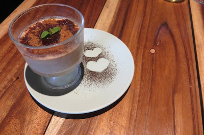
Cuore Bistro and Social Lounge was kind enough to host the second meeting of team PSST last August 6. It is the first restaurant venture of the Col Cuore Corporation. They serve happy-hearty comfort food influenced by international cuisines, travels and the founders’ personal favorites. They serves salads, pastas, calzones and brick-oven pizzas. A full bar completes the dining destination.
CUORE is Italian for “HEART” and COL CUORE is an Italian phrase that means “WITH THE HEART”. Heart is the center of everything at Cuore. It’s the love of life, love of career, love for meaningful relationships and memorable moments that are the driving forces behind Cuore, its founders and its staff. They do everything at Cuore “with the heart” and they like sharing this feeling to their guests.
The place is homey and personal. It is undoubtedly welcoming; perfect for intimate dinners, chill night outs, group dinners, or some alone time. The ambiance is industrial yet elegant, with cool color tones mainly blue and gray that gives the place a cozy and familiar vibe. The furniture is mostly wood which gives warmth to the space.
Sweet Stolen Kisses PHP340 Solo PHP495 Share
Salads are made with fresh salad greens and other ingredients. Dressings are homemade and infused with a variety of flavors.
You're Kind of Hot PHP365 Solo / PHP580 Share
Pasta choices vary from light to heavy. Oil-based and cream-based sauces are available. They offer classic favorites such as pesto, carbonara and aglio olio, as well as unique flavors that cater to the more adventurous palates - like the stroganoff pasta and chorizo pasta.
Chicken Garlic Pesto Dirty Calzone PHP365
Cuore’s take on the traditional Italian dish from Naples! Their calzones are made with the idea that it’s okay to get your hands dirty when enjoying a folded pizza loaded with stuffed goodness inside. Vegetarian option for this dish is available.
Deep Lover PHP210
Dolce Maria PHP280
They offer in-house dessert choices made with love. The cinnamon drizzled churros with salted caramel and ice cream is a must-try!
Skinny Dipping PHP175
Lemon Butter Chix and Chips PHP230
Food and drinks are priced competitively. You're not stepping out with just with a delighted tummy but also with your wallet happy. Like their Facebook page HERE and follow their Instagram account @cuoremnl.
Aside from the holidays, one of the few things that excite me when it's the season (to be jolly) is Starbucks' planner season. I know smartphones nowadays are equipped with scheduling and task manager apps, but I'm old school. I still love to write down stuff. Comment aye if you're just like me!!!
I knew that 3 of the 4 will come in standard issue colors - green, red, and black, but I wondered what the last one was. I was hoping that it will be something special. Lo and behold a white planner!!! I heard angels singing. This is the first white planner they ever released! It was a done deal.
I make it a point to visit the store on the first day just so I can get one sticker free. Too bad this time around they only offered it to the first 100 customers per branch if I'm not mistaken.
Although it was nice to have it in a box, I really like the packaging this year... Because there was none!!! It was simply wrapped in plastic. The design is minimalist, very pleasing to the eye. It definitely looks more chic and sophisticated. Aesthetics-wise, I give it 4.5 stars.
I don't favor garterized planners because they wear out overtime, especially when used often. This is probably the 3rd or 4th time Starbucks released a garterized planner.
I have never owned or used a Moleskine planner. But I am aware of the brand and I've seen some of their products. If you've had one please comment your feedback, I'd love to hear what you think about their merchandise.
Here's a thickness comparison. Love the fact that I'm saving purse space. Yes I carry mine everyday, if you were wondering.
The daily planners were cute. I prefer weekly. It was nice to have options though.
The instant bookmark was a disaster. It looks cheap. Whoever thought of this should consider the fact that some patrons are not crafty.
And why would I need a paper bookmark when there's this ribbon thingy? Someone please enlighten me.
The "coffee reward" note is completely unnecessary. If I lost mine and someone returned it, I would simply say thank you. So nope. I mean, come on. Starbucks, please don't inscribe this again.
And who would even think of filling out all these personal information?!? The personal information section of the previous planners were good enough. This is over the top. Waste of ink and space.
I did appreciate the additional space beside local holidays. More space for me to scribble notes on.
They introduced moon phases on the monthly calendar spread... Cute... I don't think I need this information though. It's not like I'm a werewolf or something.
More subtle changes like the week count. Again, I don't need this. I don't think a lot of people need this too. But it's a nice touch.
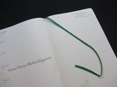
The page looked a little weird with the lines on the right and not having any on the left. But finally my prayers were heard - more space for notes. Alas!!!
The back now has several pages with just these dots all over. More writing space for me so thank you. I may even consider connecting them to form... Something...
Unlike last year's. I saw this page once, I didn't bother looking at it again.
This part is very useful. The envelope design this year is much more convenient to use.
The only thing I hate is the leaf - it's too thin. Writing is very visible on the other side regardless if I use a Pilot GTEC .04 or a Parker Jotter Ballpoint. A Panda ball pen may even produce the same results. I also fear that the page will tear easily. See that water droplet spot? You can almost read the print from the next page. It's that fine.
Collecting the stickers seemed to be a bit more costly now overall, I am happy and satisfied with the Starbucks 2016 planner. How about you? Share your thoughts on the comments section!


